Two smartphones against blue background displaying The Tobacco Atlas app; one shows the app cover and the other shows part of an article on tobacco epidemic.

The Tobacco Atlas

Designing a web-based information hub for the fight against big tobacco.

CHALLENGE

Design a global platform that can serve multiple audiences, guiding the public through the challenges and solutions of tobacco control while also supporting researchers and advocates who need tobacco pricing data in forming policy.

OBJECTIVE

Shape the experience as one connected system with two outputs: a chapter-based website that uses progressive disclosure to move users from narrative context into deeper data, and a pricing collection app designed for fast field entry and reliable review so teams can translate on-the-ground data into policy-ready insight.

PROJECT TYPE

Website
Mobile App

CLIENT

John Hopkins University

TIMELINE

Jan ‘23 - Oct ‘25

Designing the Website: Story → Evidence

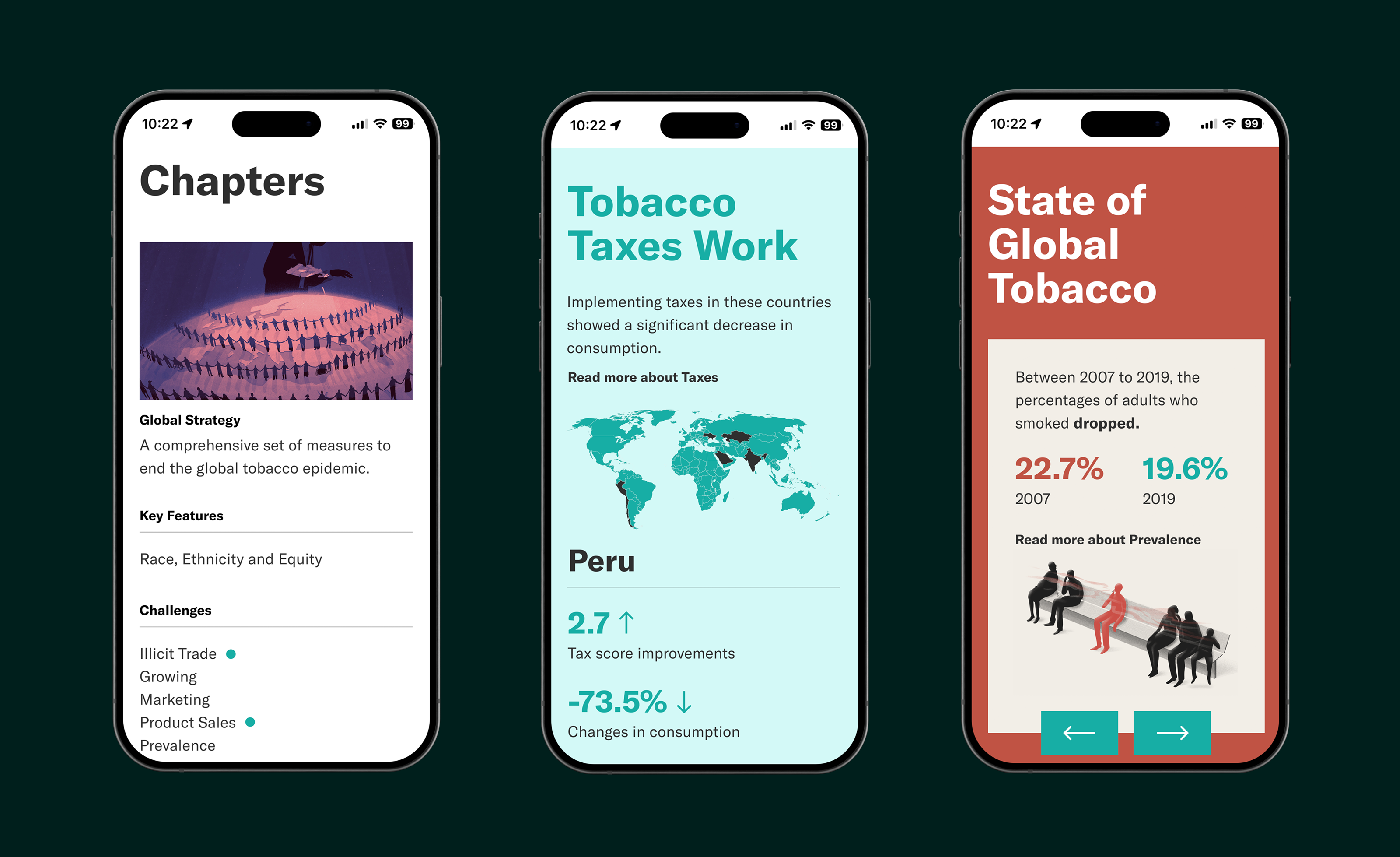
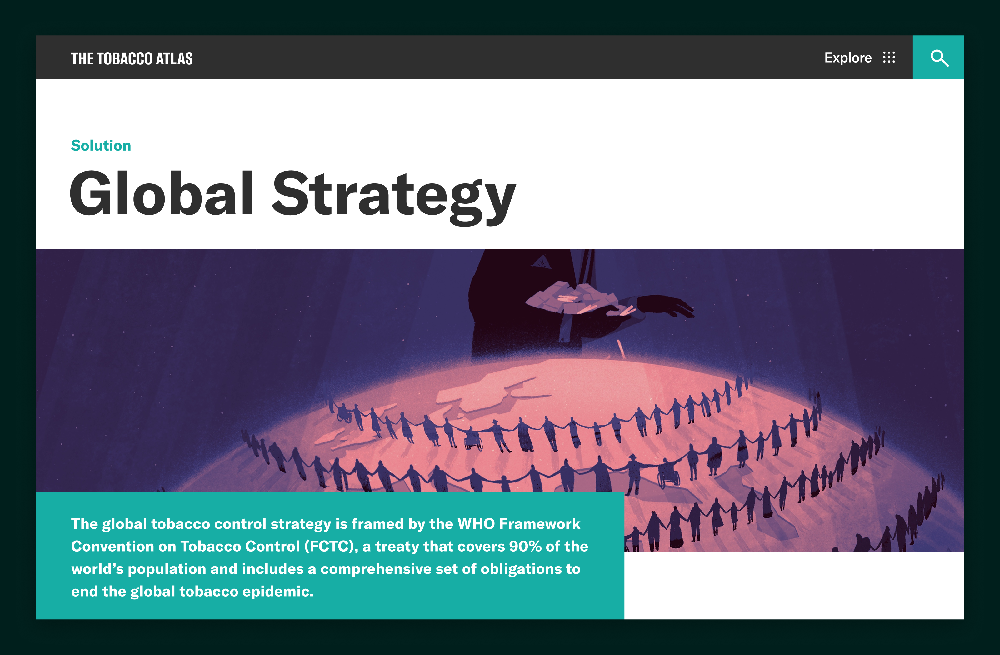
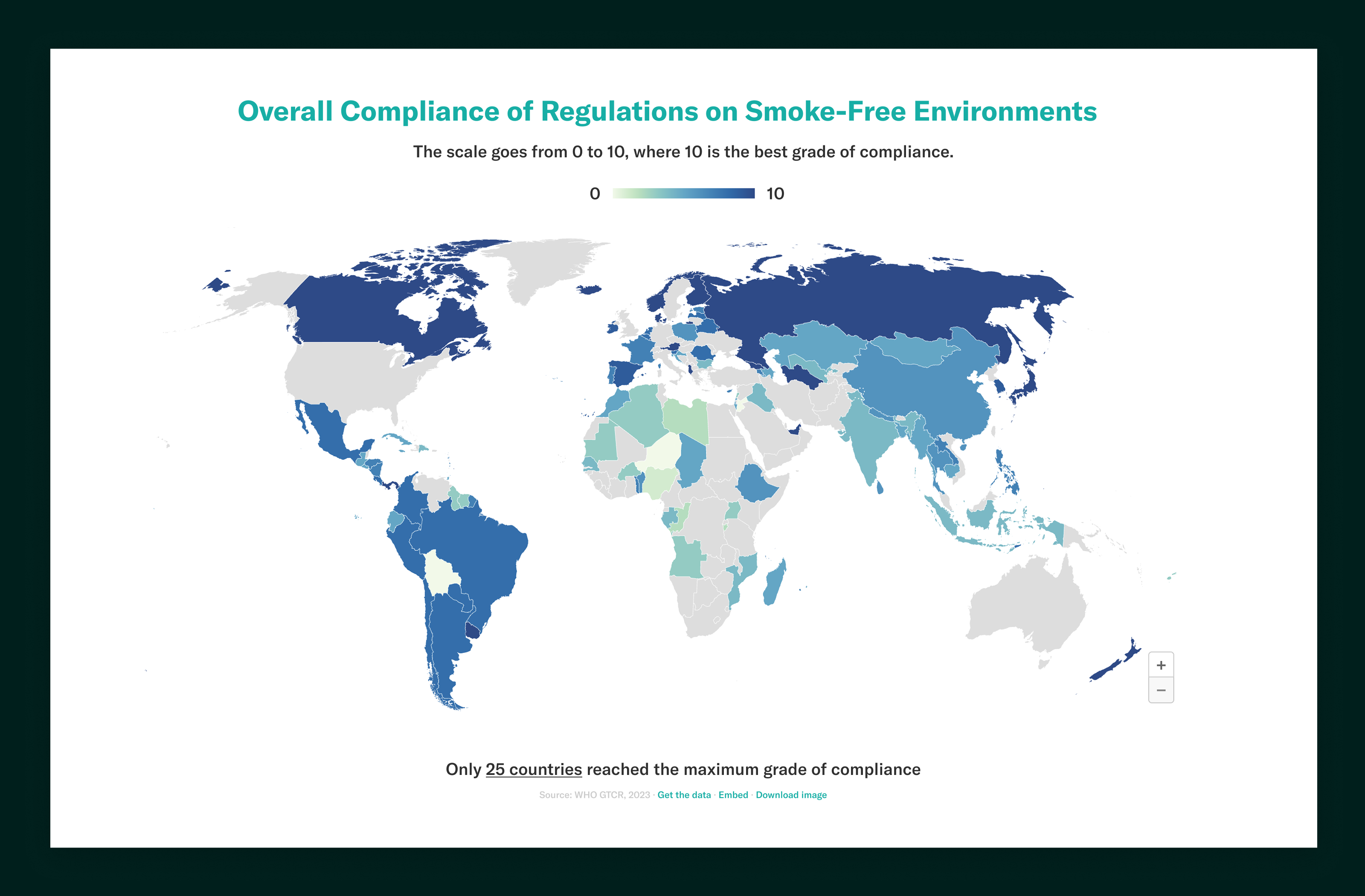
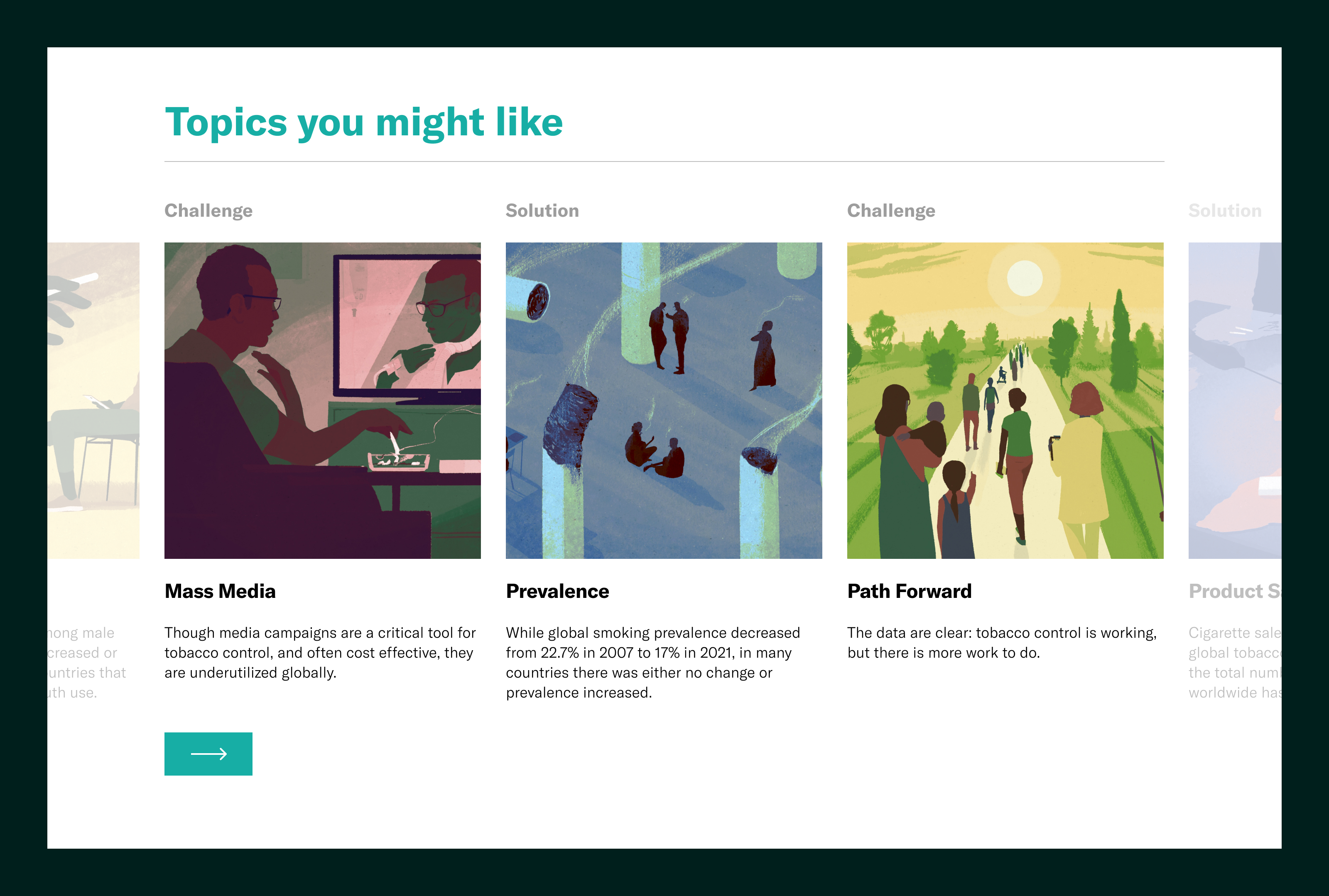
Because the Tobacco Atlas is traditionally a book, the site follows a chapter structure by design.

I focused on how much to show and when, building a progressive disclosure system that keeps the narrative readable upfront and makes deeper evidence easy to access without overwhelming users.

Website header titled The Tobacco Atlas with message about the ongoing tobacco epidemic and an illustration of large cigarette dominos standing on a world map with silhouetted people.
Illustration of diverse people holding hands in concentric circles around a glowing earth with a large figure overseeing above.
World map showing overall compliance of regulations on smoke-free environments by country, with a color scale from 0 to 10 indicating the grade of compliance.

Designing for Exploration: Read → Discover

The visual system supports exploration through clarity-first UX: strong typography, consistent modules, and clear wayfinding across long-form pages.

The goal was to make it easy to scan, stay oriented, and choose your depth, whether you’re reading for context or digging into evidence.

Text explaining that tobacco products cause harm and pollution through their life cycle: production, consumption, and disposal, with detailed environmental impact description.
Illustrated images paired with text blocks on tobacco-related topics including Challenges and Solutions for Product Sales, Cessation, Growing, and Global Strategy.
Smoking prevalence reduction calculator for Argentina showing baseline smoking prevalence at 21.1%, desired prevalence at 20.1%, economic cost savings, cigarette price, tax per pack, and expected tax revenue gain.
Bar chart showing cost-of-illness attributable to smoking with productivity loss due to mortality at $16,476,680,000, morbidity at $1,977,070,000, health expenditure at $1,678,450,000, totaling $20,132 million annually.

Designing the Pricing App: Capture → Sync

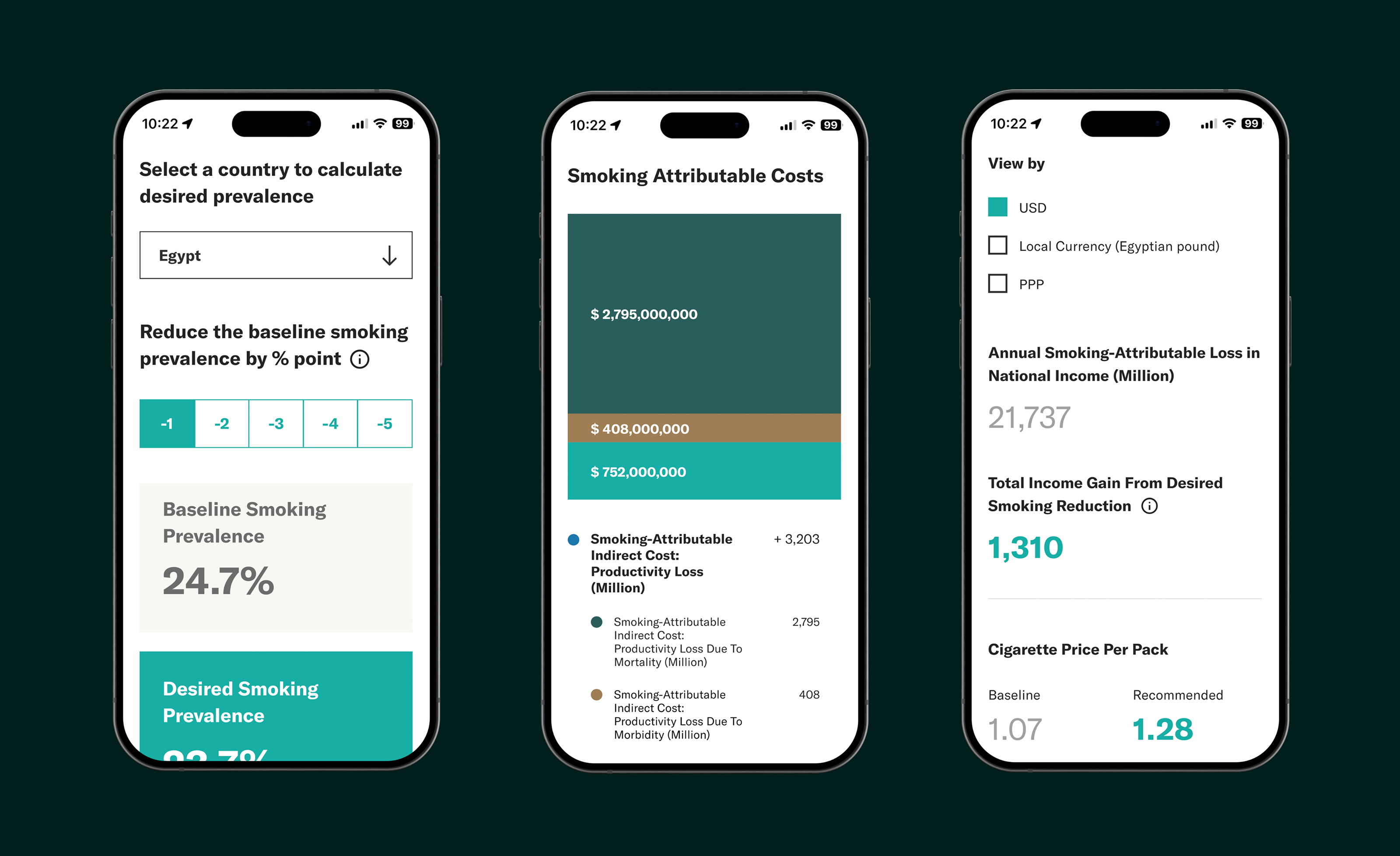
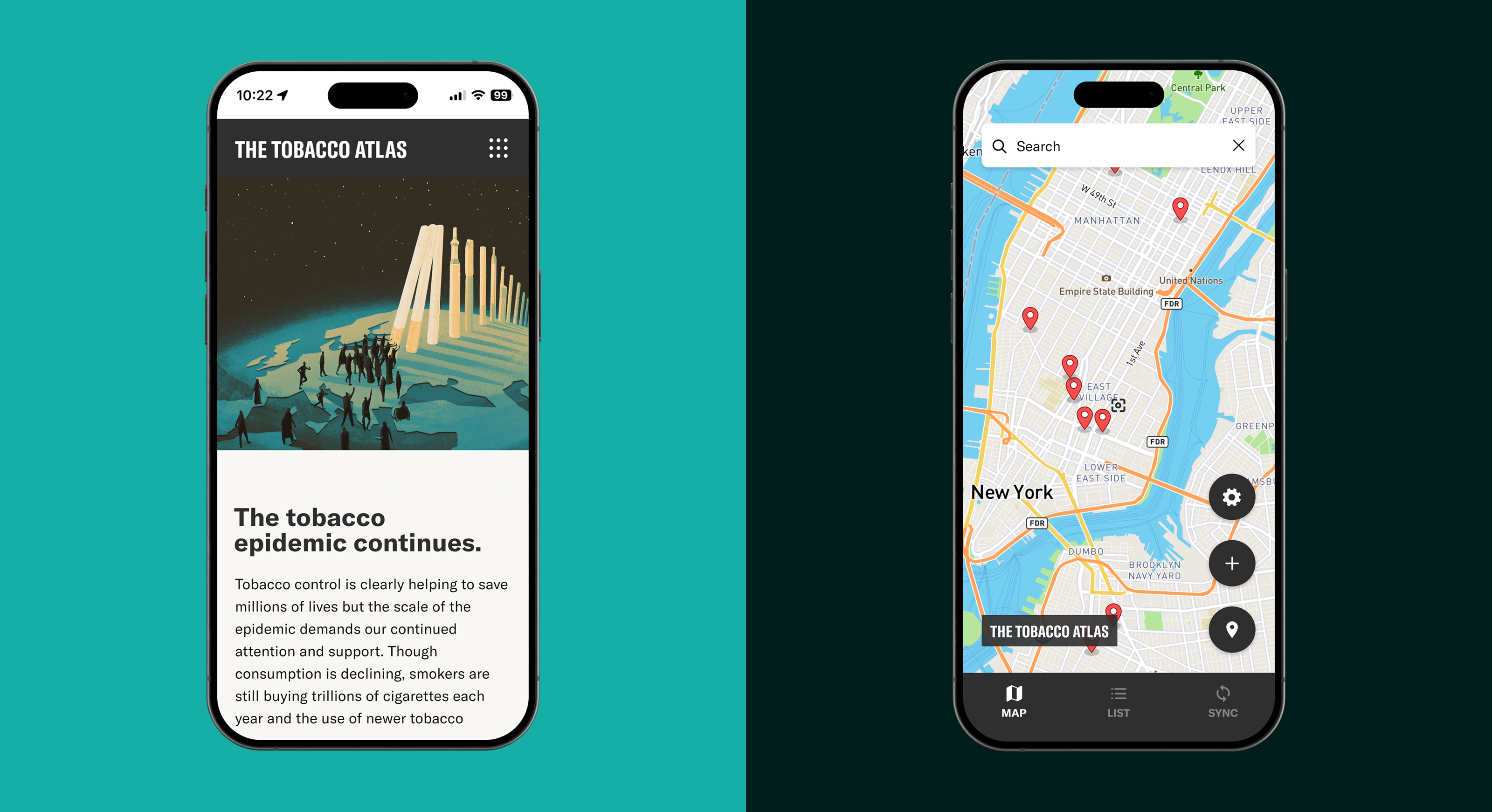
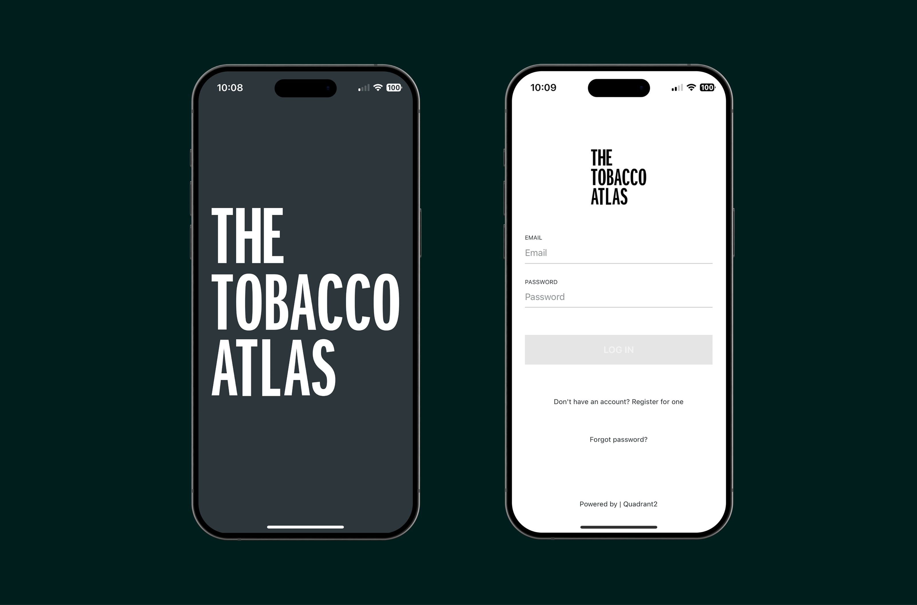
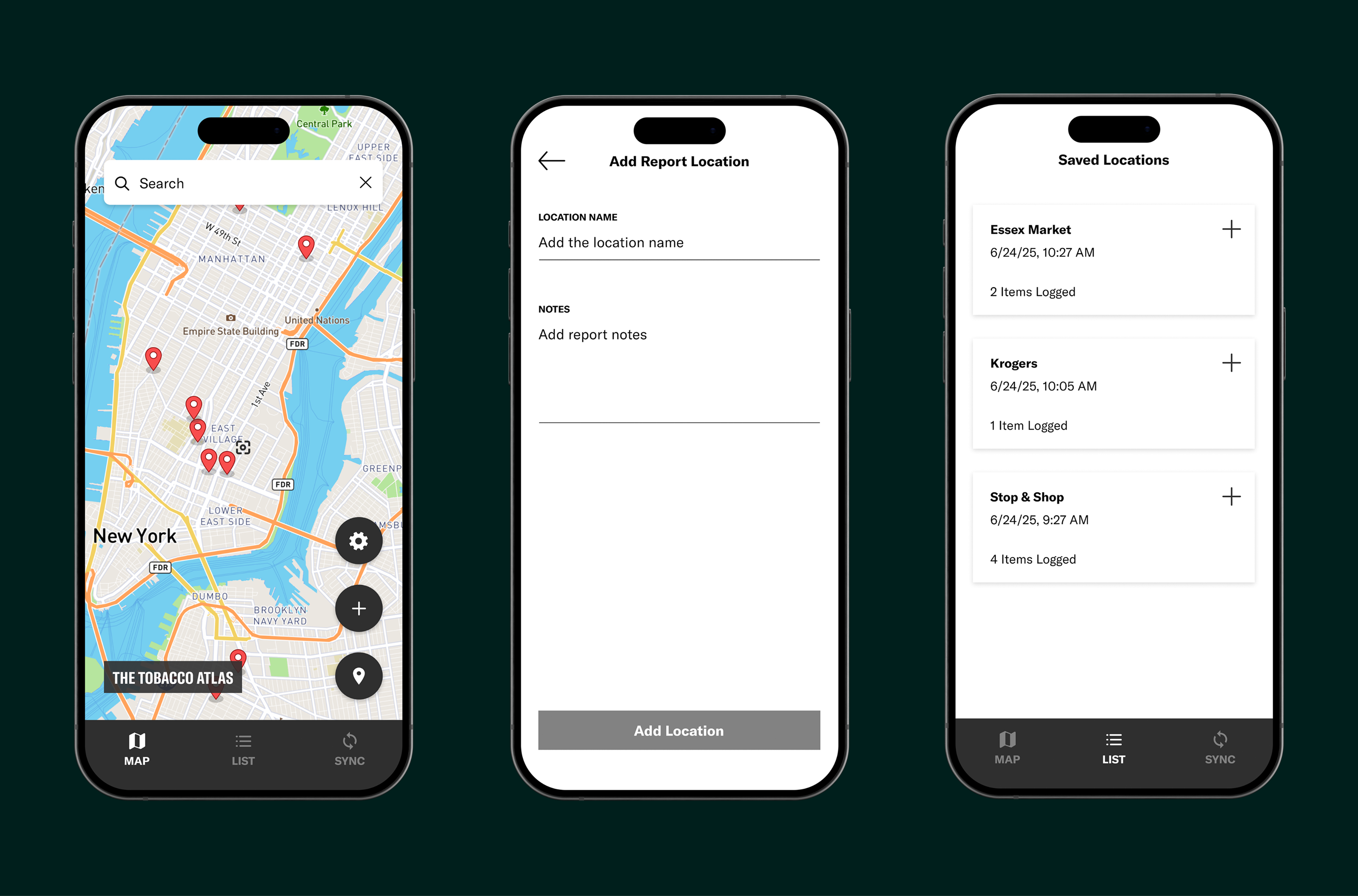
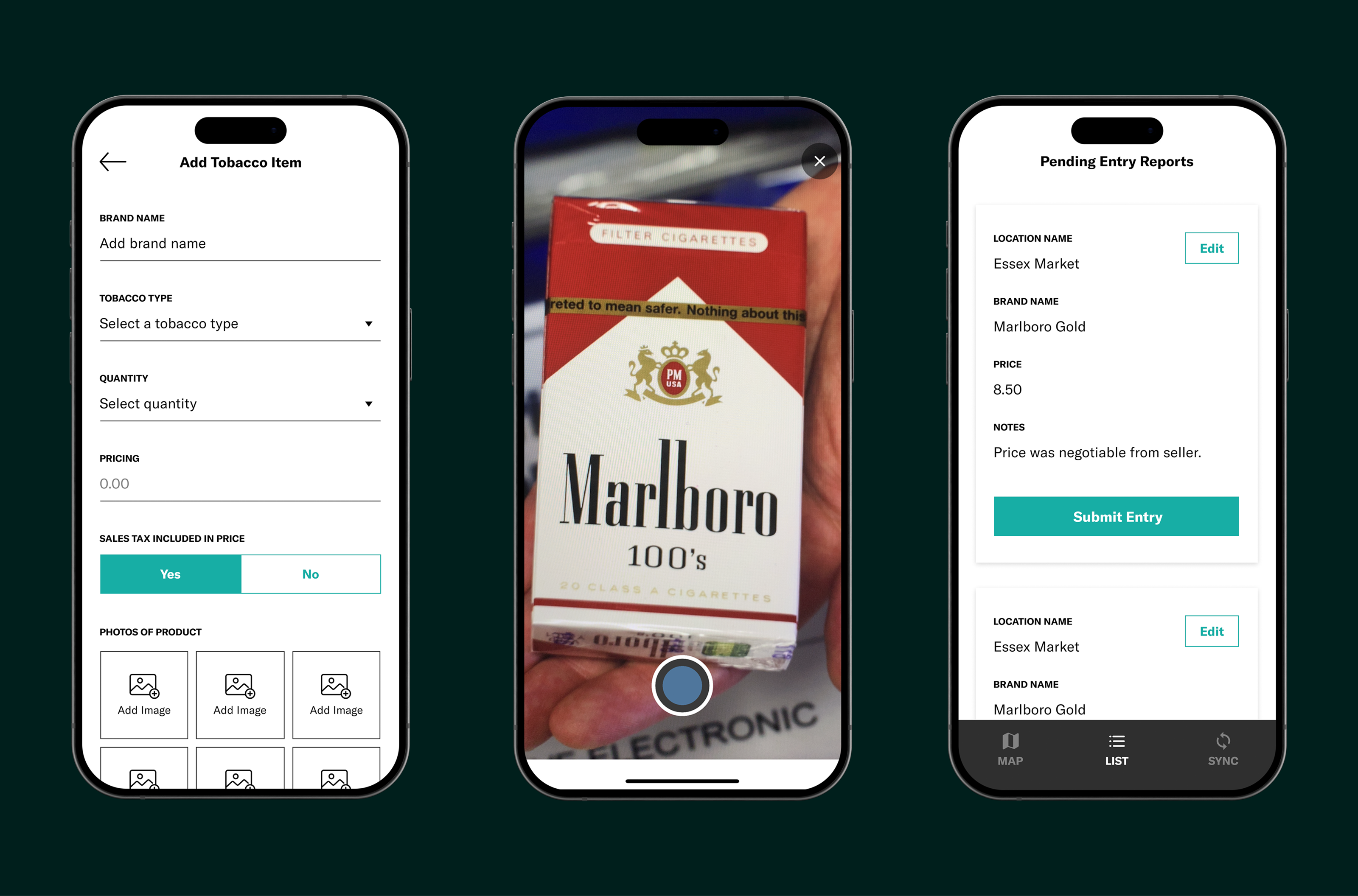
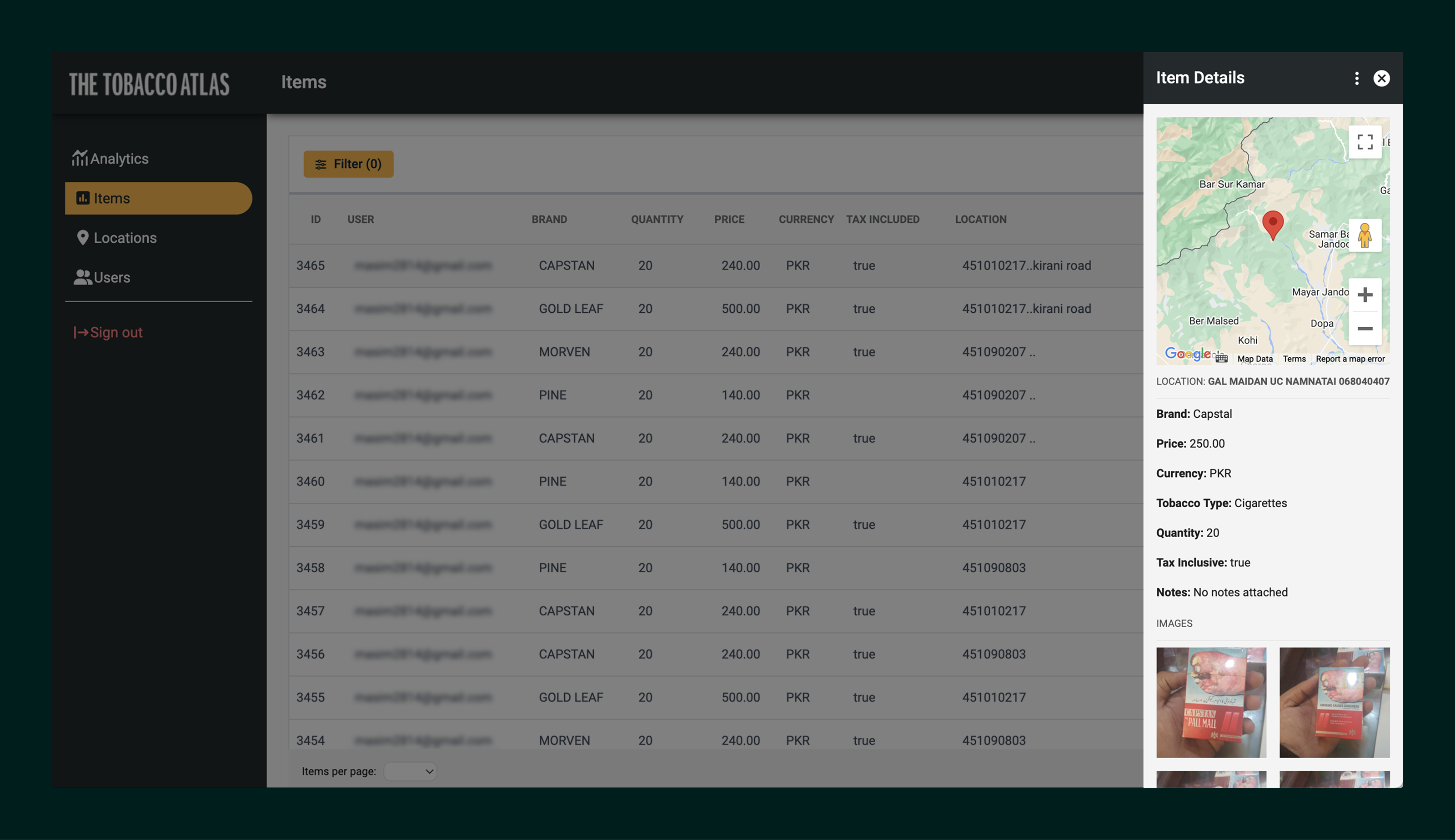
To support the fight against Big Tobacco beyond storytelling, the Pricing Collection Application extends the Tobacco Atlas brand into the field. The UX was designed around real-world constraints; Time pressure, inconsistent connectivity, and high variability in locations and products.

Clear workflows separate data entry, review, and submission, with structured fields for consistency, optional evidence capture (photos/notes), and offline-first syncing so teams can collect accurate pricing data across countries and contexts.

Two smartphones showing The Tobacco Atlas app: the left screen displays the app's title in large white text on a dark background, the right screen shows a login page with fields for email and password, a disabled log in button, and options for account registration and password recovery.
Three smartphone screens showing a location-based app: a map with pins for tobacco shops in New York, a form to add report location with fields for name and notes, and a saved locations list with names and timestamps.
Three smartphones display a tobacco tracking app showing: form to add tobacco item on left, photo of Marlboro 100's cigarettes pack in center, and pending reports list with Marlboro Gold and Marlboro Red on right.

Designing the Data Hub: Validate → Analyze

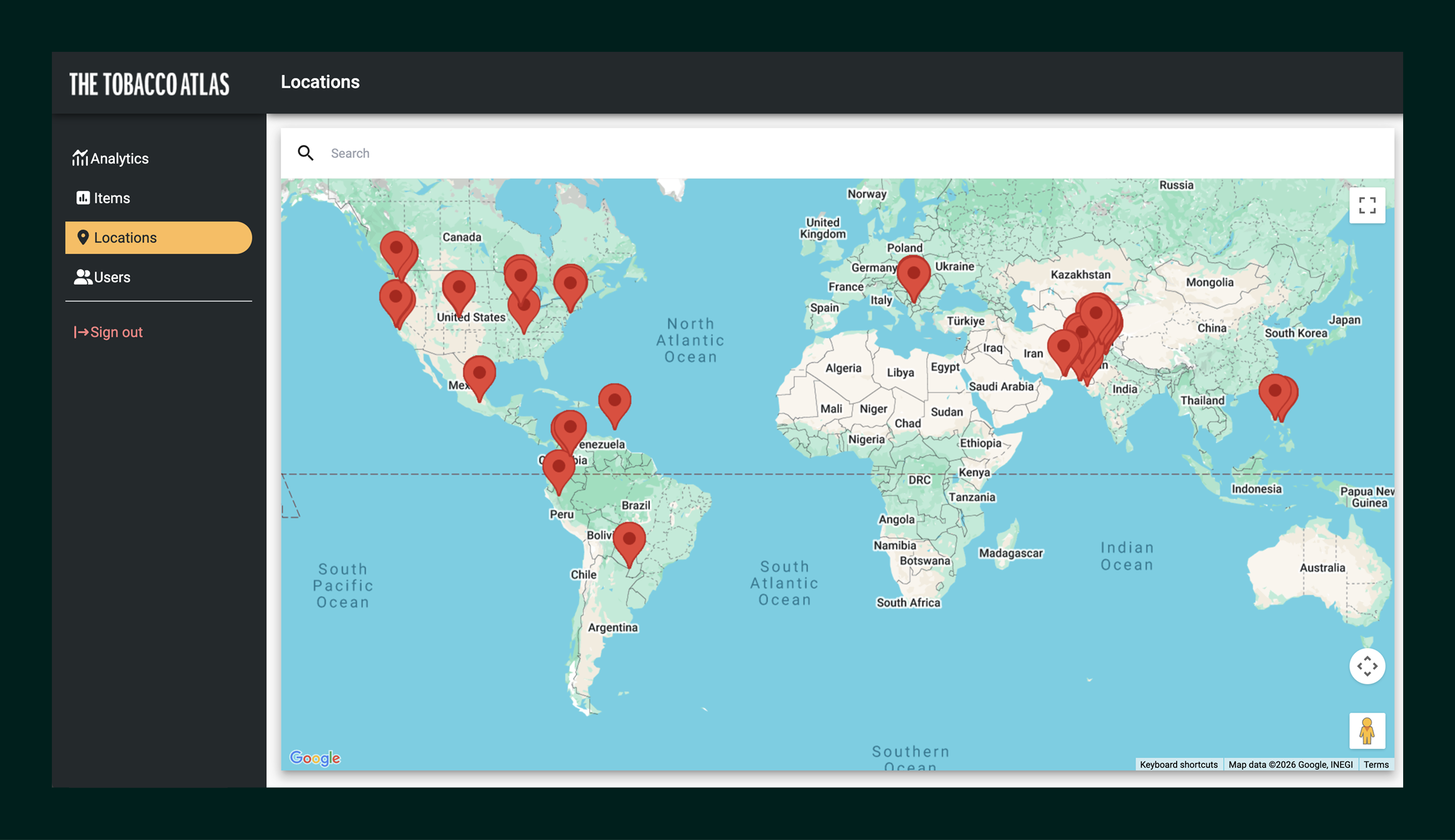
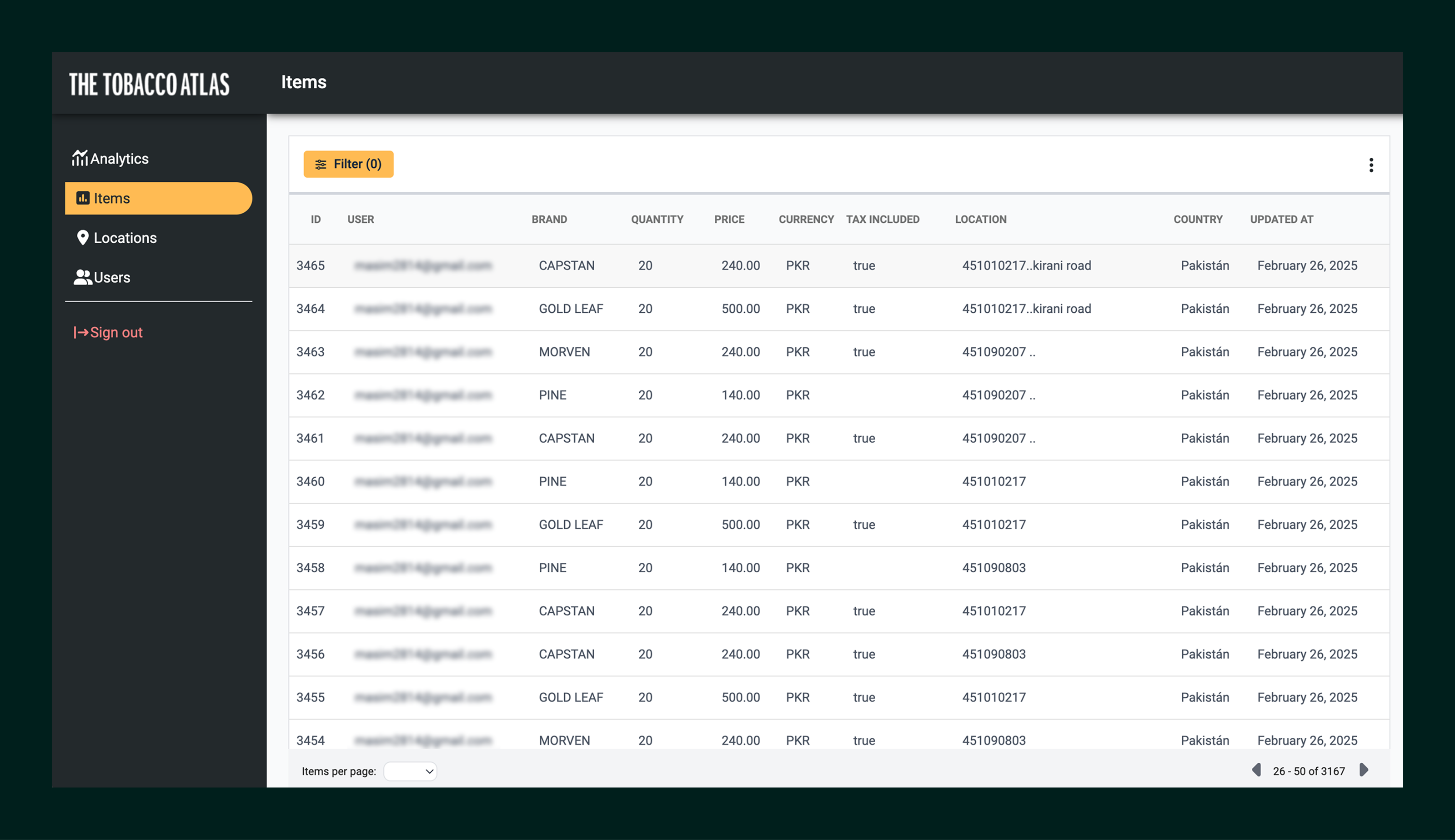
Pricing data collected in the app is uploaded to a separate hub, where researchers and policymakers can validate, filter, and analyze entries.

Interactive tables, maps, and comparison views help teams identify regional patterns, spot outliers, and translate raw observations into evidence that can support advocacy and policy briefs, connecting field realities to decision-making.

Map interface titled The Tobacco Atlas showing red location markers across North America, South America, Europe, and Asia.
Dashboard screen from The Tobacco Atlas showing a table of tobacco product items with columns for ID, user email, brand, quantity, price in PKR, tax included status, location, country Pakistan, and last updated date February 26, 2025.
Dashboard interface showing a list of tobacco product items with details like ID, user email, brand, quantity, price, currency, tax inclusion, and location, alongside a map and item details panel.

Outcomes

Website

EMPOWER

Supported decision-makers with an accessible, trusted source for tobacco control evidence

BRAND SYSTEM

Reinforce key information through consistent data presentation and UX patterns built for reuse

GROWTH

Established the foundation for expandable tools and interactive analysis (e.g., Cost Recovery & Revenue Estimator)

Application

SCALE

3,500+ pricing entries collected across multiple regions

EFFICIENCY

Time-to-entry reduced from ~7–10 minutes → ~4–6 minutes

COVERAGE

Offline-first collection enabled coverage in low-connectivity areas

Explore More Work

Website header with text 'Sabotage, Deceit and Duplicity' and subtitle 'British American Tobacco Uncovered' overlaid on images of British pound banknotes.

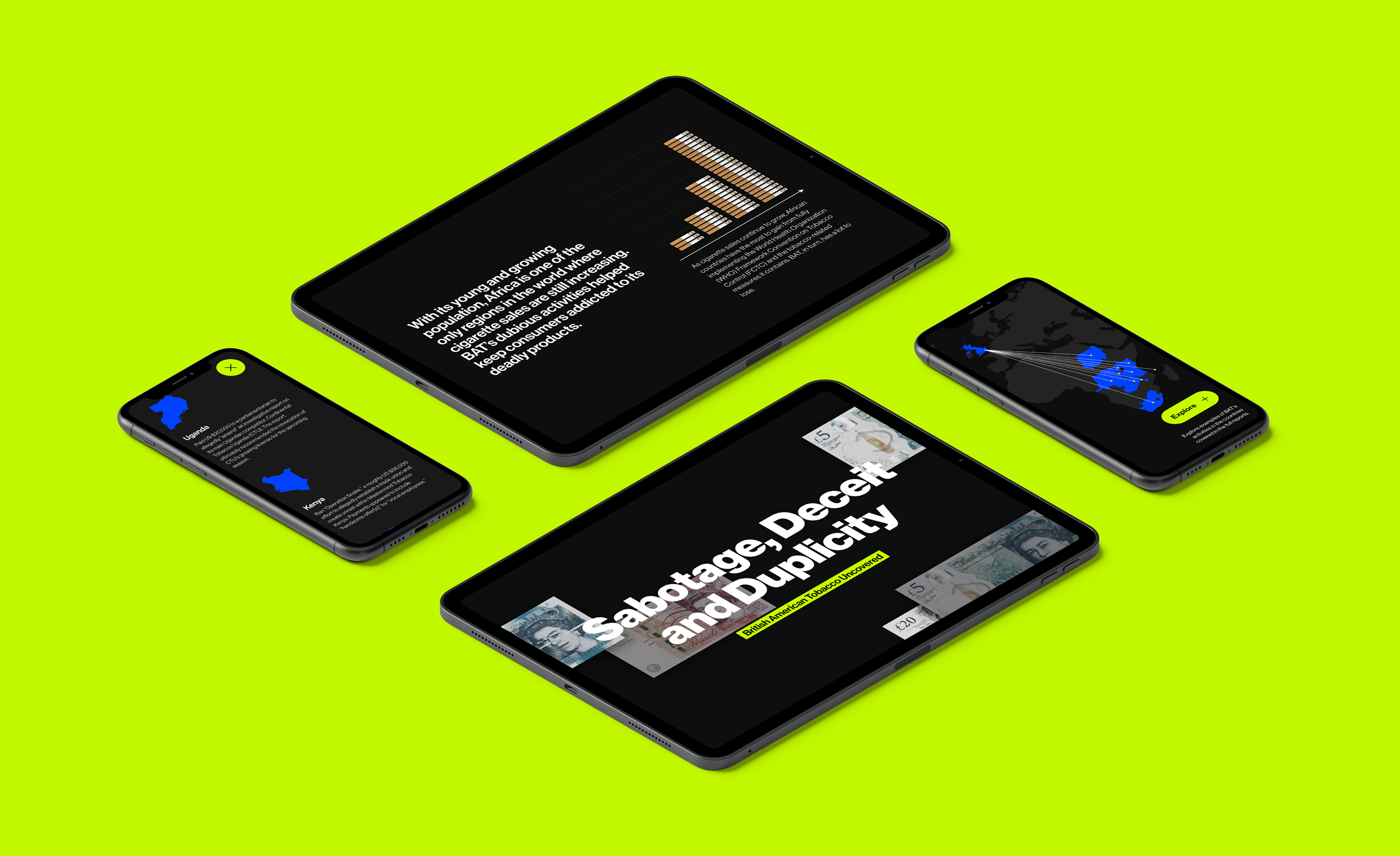
An editorial web experience designed to make corporate deception visible and accessible to advocates.