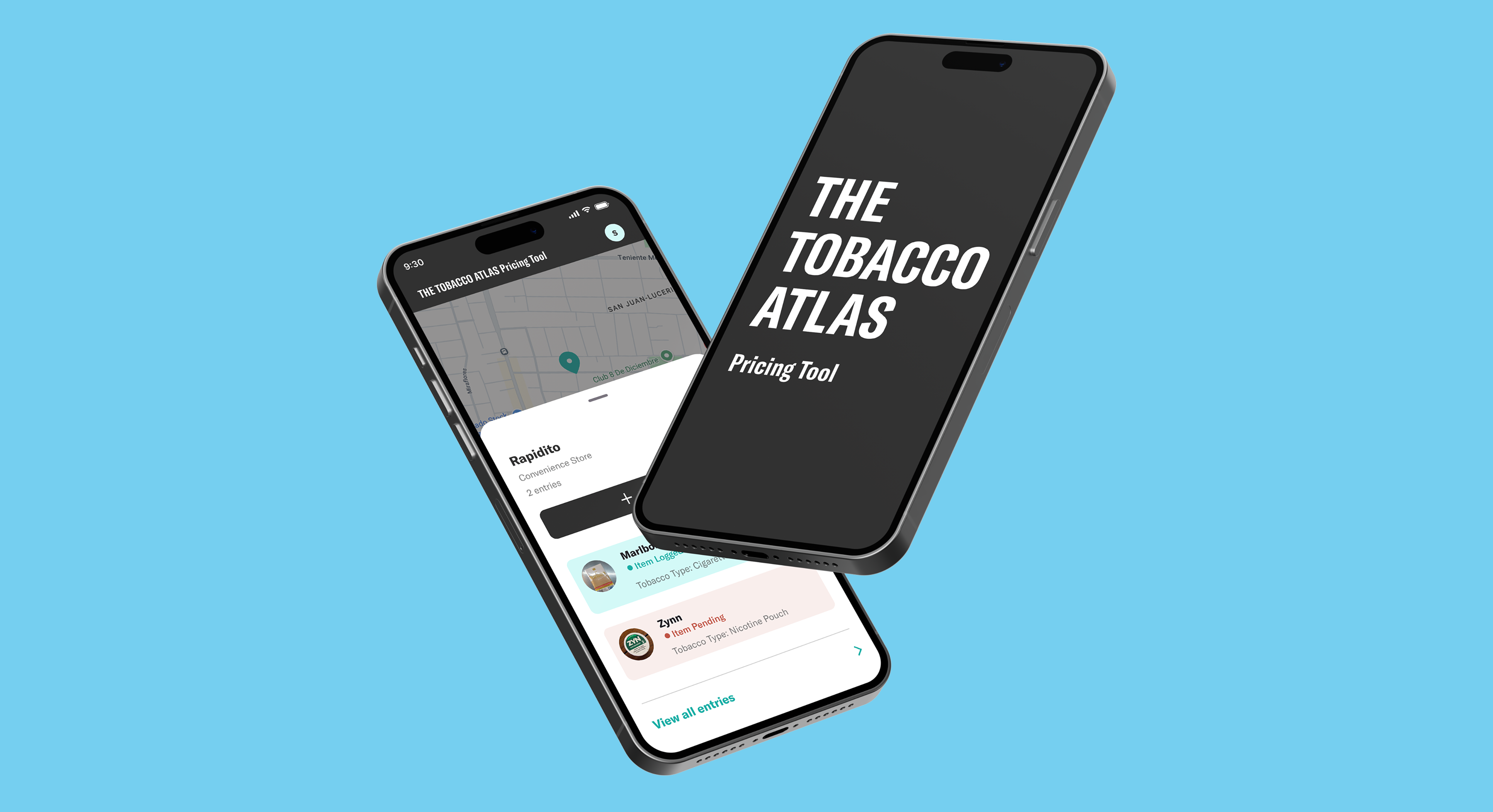
CHALLENGE
The legacy application was difficult to navigate, time-consuming, and prone to inconsistent entries. When field teams are collecting data, unclear workflows or lost submissions could undermine the quality of the research.
OBJECTIVE
Redesign the mobile and web experience around the realities of fieldwork, making accurate entry easier and giving research teams a clearer way to review and use submissions.
PROJECT TYPE
ROLE
CLIENT
TIMELINE
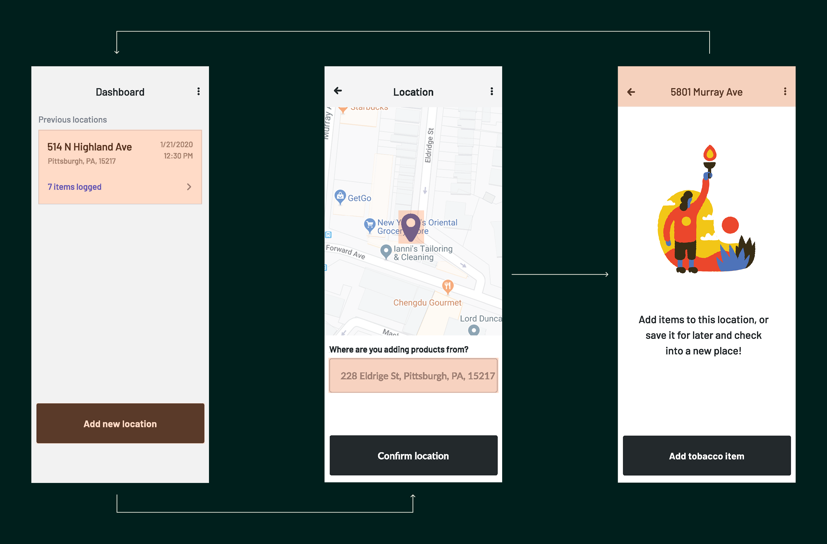
The legacy experience dropped collectors directly into a location-entry flow without persistent navigation or a clear home base. Locations had to be added manually by address, giving users little context for where they were or what they should do next.
Saved locations could only be revisited from the opening dashboard and were identified by address alone. This made them harder to recognize and manage, while offering no simple way to review details or add useful context after creation.
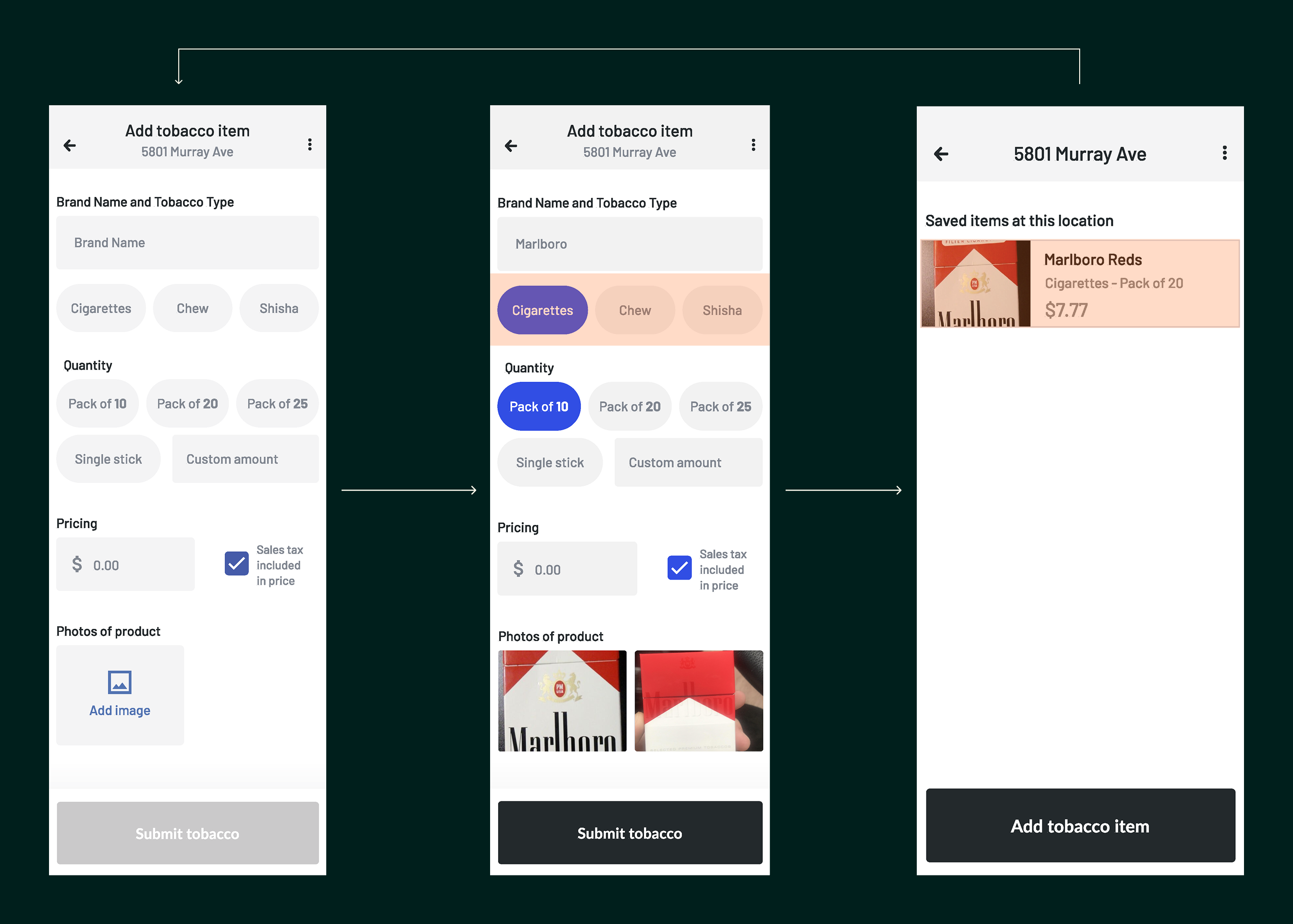
The product-entry form relied on a growing set of preset options for brand, tobacco type, quantity, and packaging. As the range of products expanded, the form became harder to scan and placed more cognitive load on collectors in the field.
The rigid structure also left little room to capture unexpected product variations or other edge cases. Once an entry was submitted, it could not be reopened or corrected, increasing the likelihood that incomplete or inconsistent data would remain in the dataset.
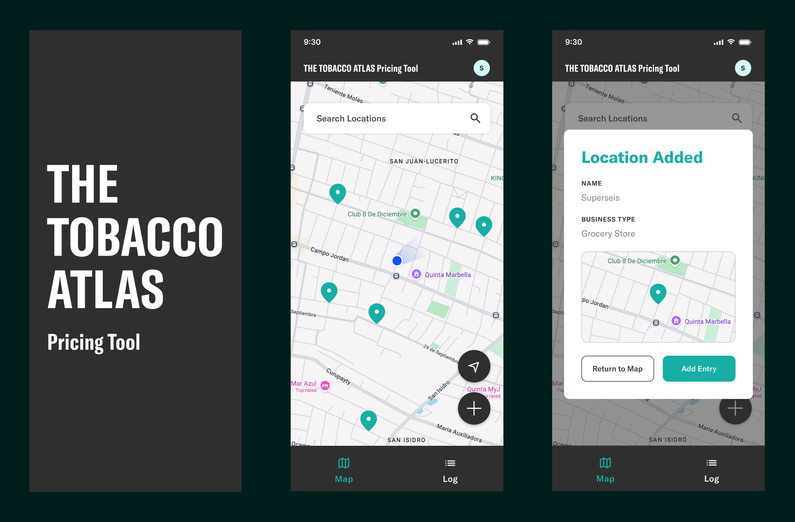
I replaced the address-first flow with a map-based home screen that gives collectors immediate context and makes nearby and previously added locations easier to recognize.
When adding a location, collectors can name the business, select its type, and confirm its position on the map. Custom business types also account for informal or market-specific vendors that do not fit standard categories.
A final confirmation summarizes what was added and provides a clear next step: return to the map or begin recording product data.
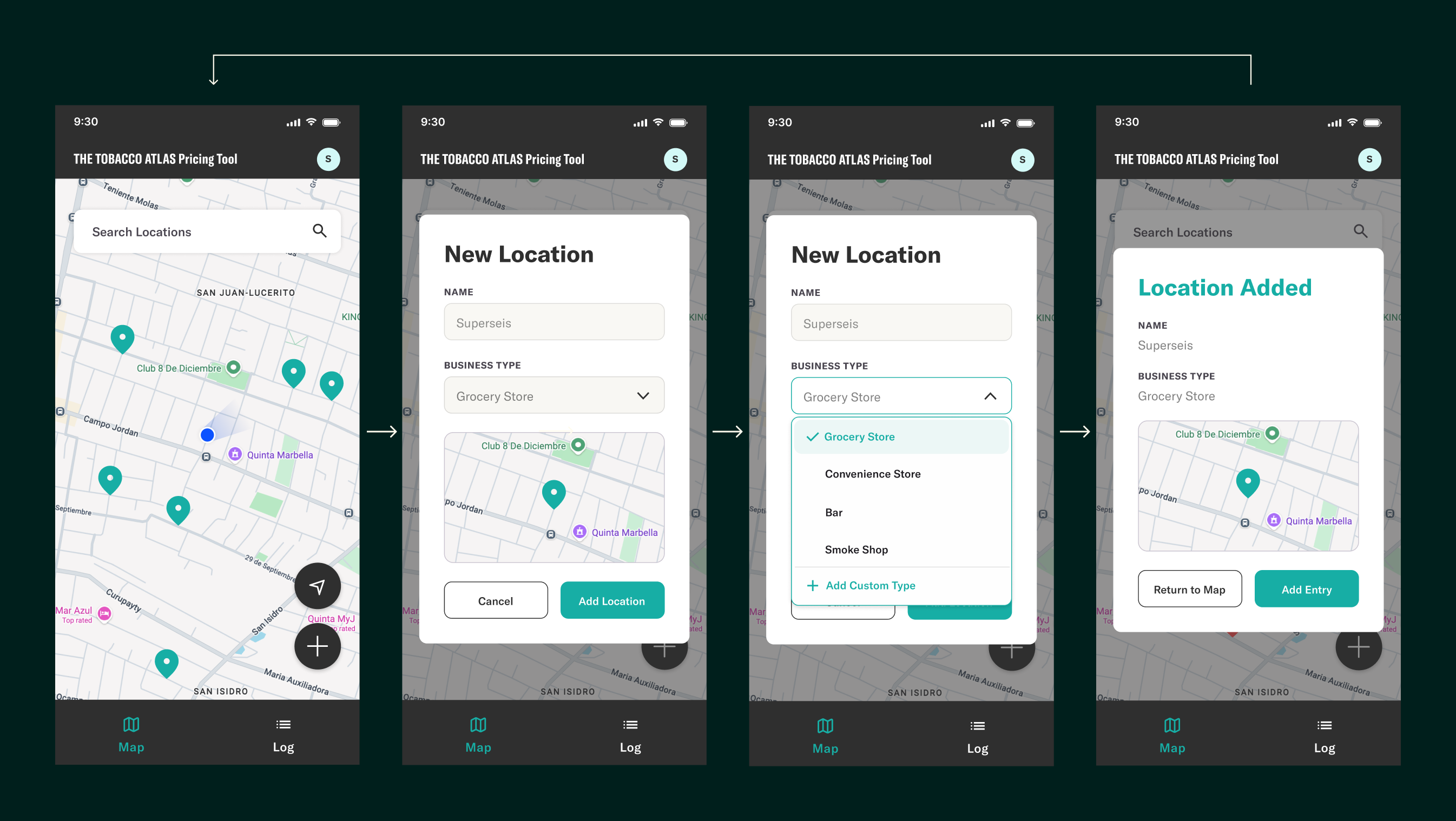
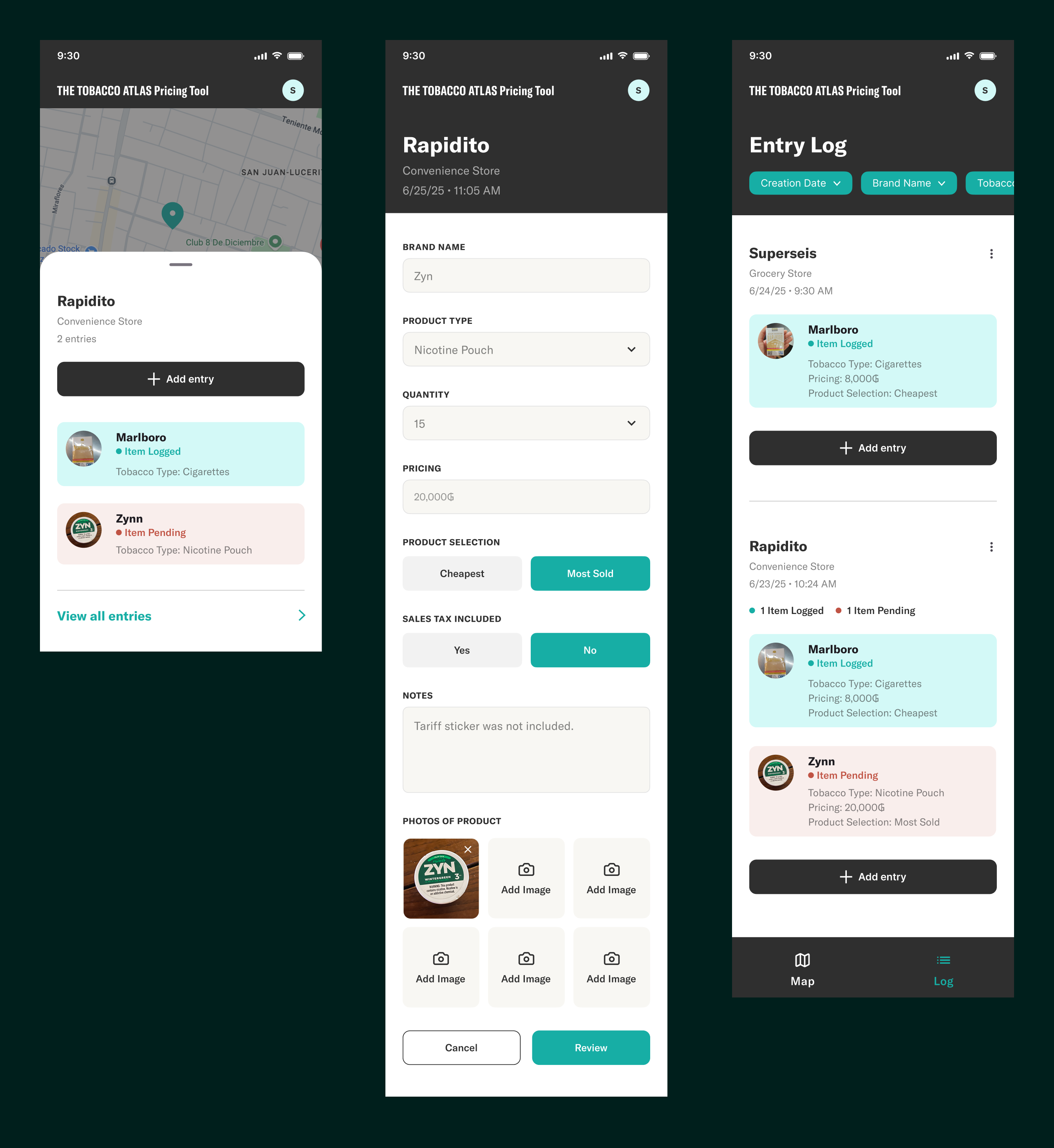
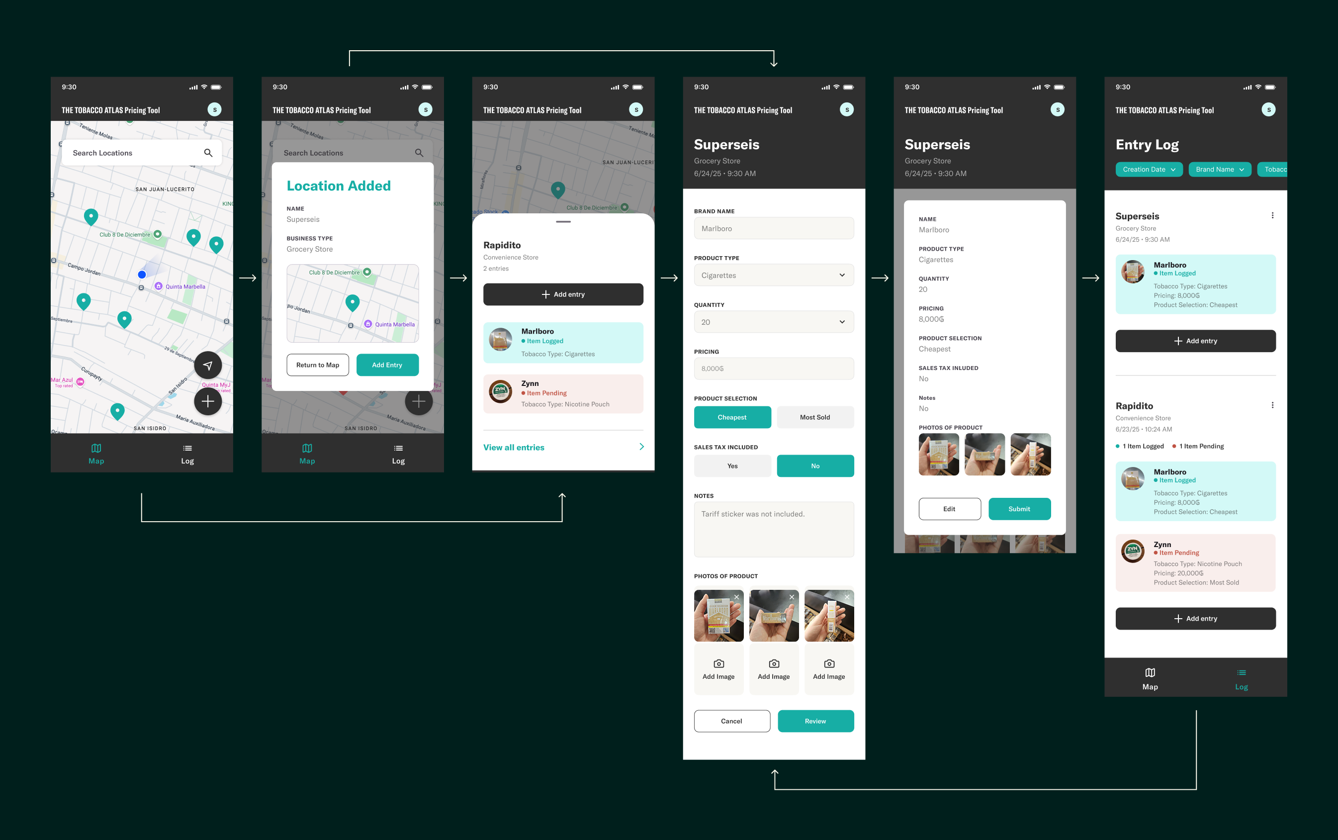
Collectors can begin a new entry from multiple points in the experience. They can revisit a location by selecting its map pin or finding it in the entry log, making it easier to continue collecting data without retracing the original setup flow.
I restructured the form around the information researchers actually need. Clear qualifiers distinguish whether the recorded product is the cheapest or most sold, while structured fields, notes, and photos help collectors document each product consistently and capture important context from the field.
Before submitting, collectors review the complete entry in a confirmation modal. This final checkpoint makes errors easier to catch and gives users greater confidence that the information they are contributing is accurate.
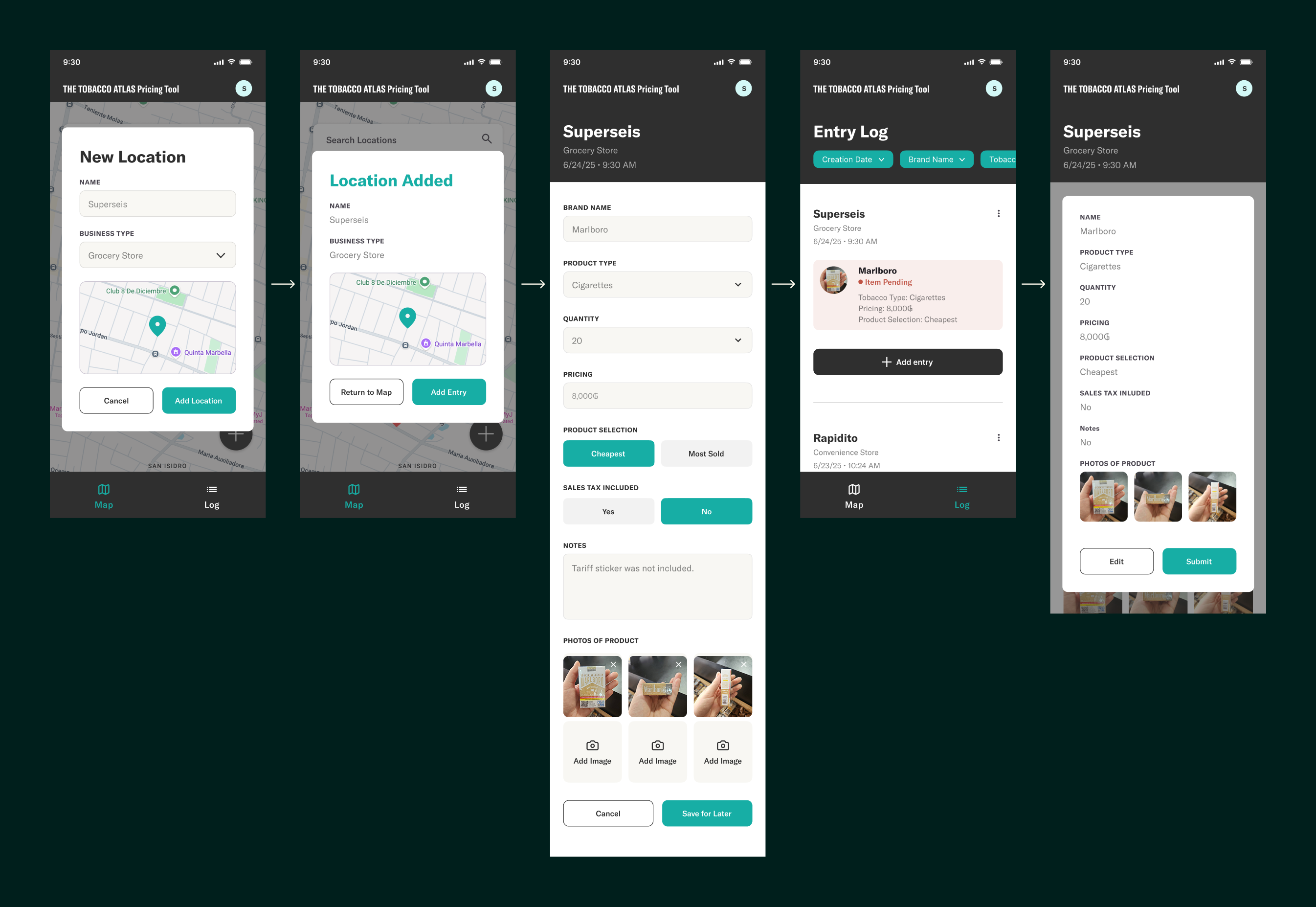
I designed the workflow to remain usable in low-connectivity environments, allowing collectors to add locations and continue gathering product data without depending on a reliable internet connection. Instead of blocking submission, Save for Later stores the entry locally and marks it as Pending in the entry log. This gives collectors a clear record of what still needs to be uploaded and lets them review or complete the entry before syncing it once a connection is available.
By separating data collection from upload, the experience could adapt to the varied conditions collectors encountered in the field without interrupting their work or risking lost data.
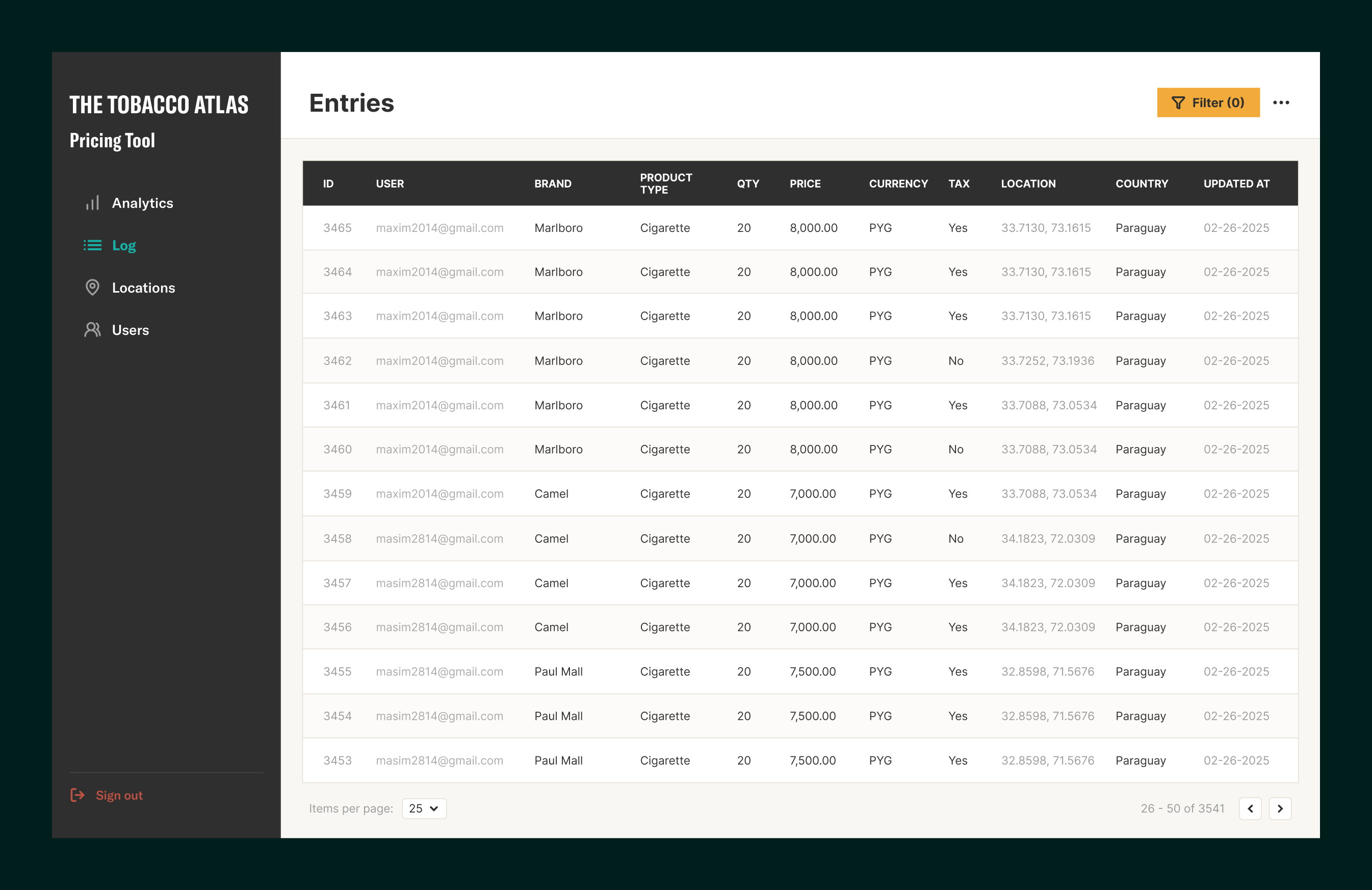
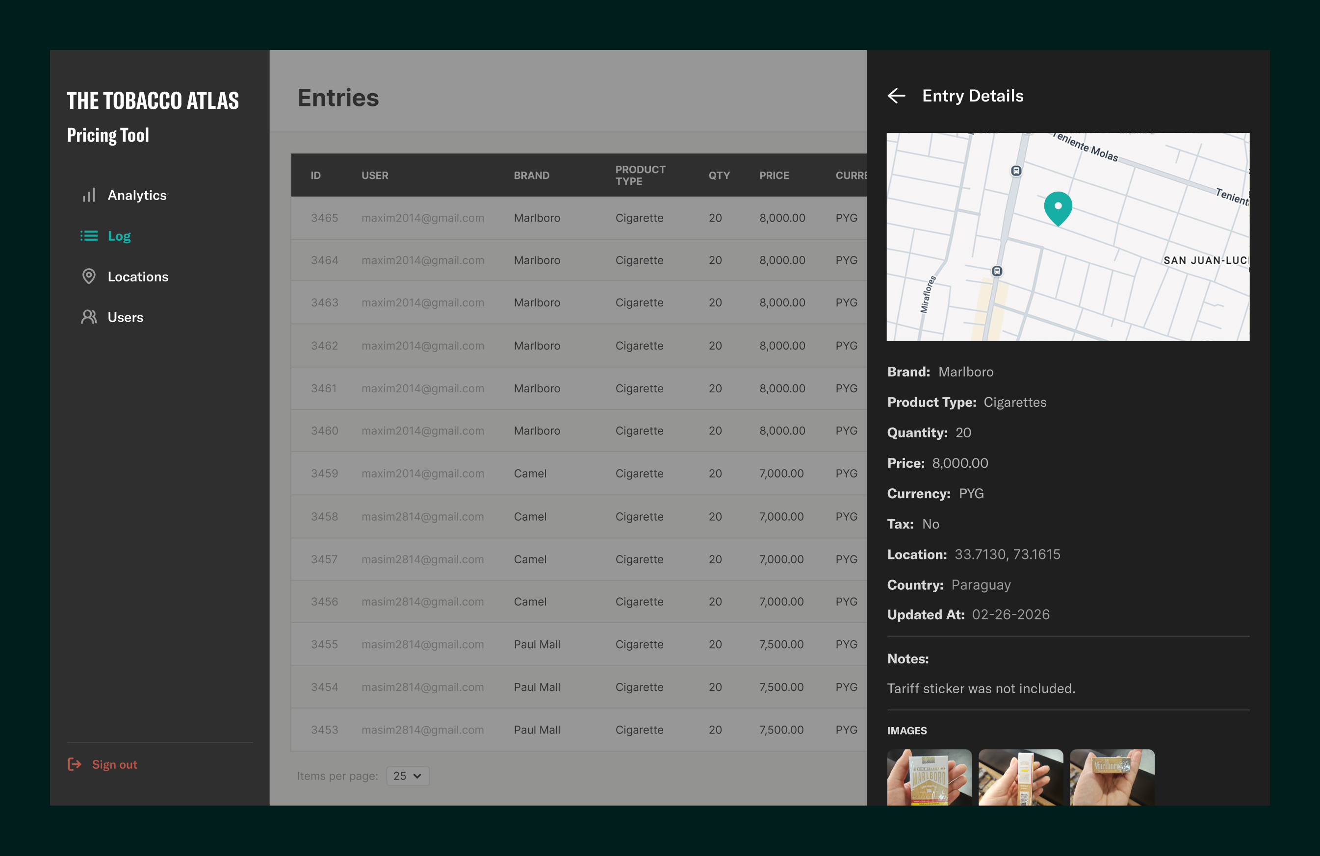
The web dashboard brought entries, locations, users, images, and submission details into one place.
Search, filters, location summaries, and detailed entry views helped research teams review submissions, identify missing information, and understand where and how the data was collected.
By connecting the field experience to a clearer administrative system, the tool supported the full process from collecting prices to preparing the evidence for analysis and policy use.
Field readiness
EFFICIENCY
RELIABILITY
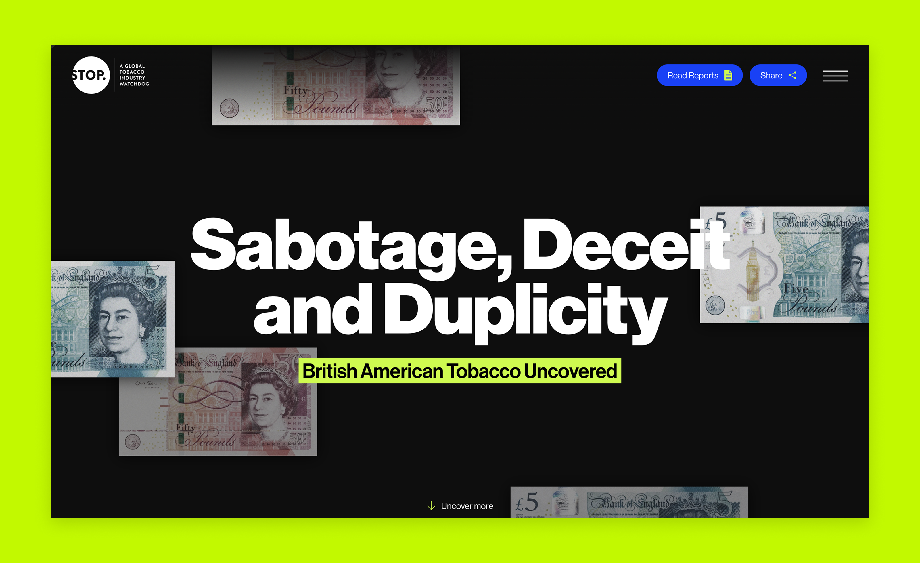
An editorial web experience designed to make corporate deception visible and accessible to advocates.


